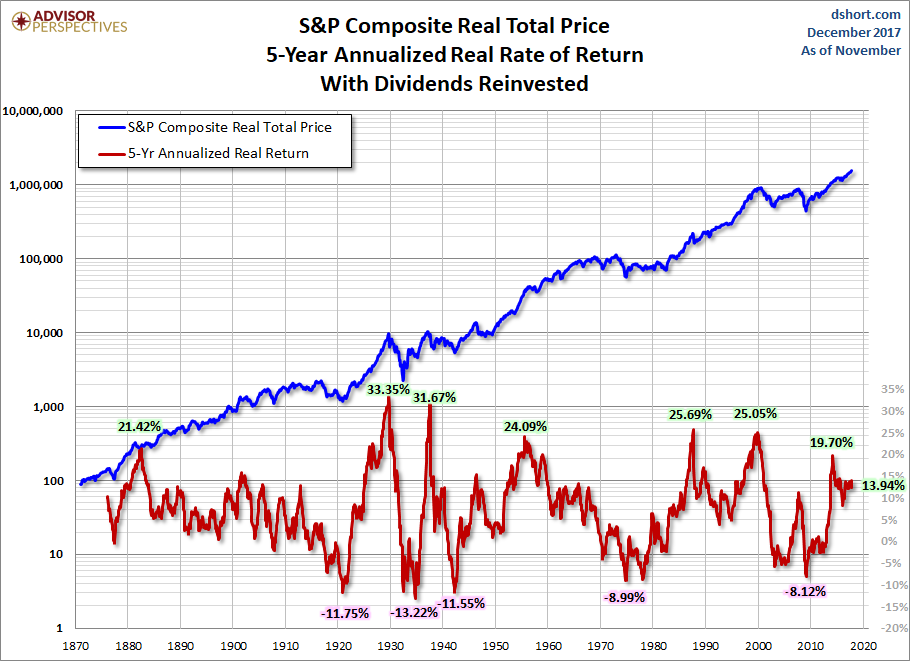
Sometime in your investing life you have likely seen the ‘mountain chart’ exhibited below illustrating the price of the S&P 500 index from 1950 to present.

Upon its presentation the statement “buy and hold always works out” usually follows. That statement would be true if your time horizon was the last 67 years. However, most of us do not have a 67-year time frame. The average person invests during their working life and then withdraws those funds during retirement. And their investing horizon during retirement is much shorter. The joint life expectancy of a couple retiring at age 65 is roughly 25 years.
The shortness of this window should affect how one views portfolio risk. Dshort produced a report reminding us that market volatility is exacerbated in shorter time frames. For example, the chart below shows the rolling 5-year return of the S&P 500 (the red line) juxtaposed against the ‘mountain chart’ of the S&P 500. As you can see, the S&P 500 exhibited negative returns in numerous 5-year periods. Note the long running period of negative 5-year returns during the 1970s.

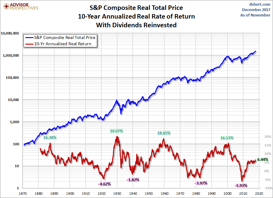
What if we lengthened the horizon to 10 years? There are still multiple time periods with negative 10-year returns.

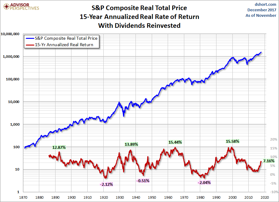
Would a 15-year horizon change the narrative any?
No, in fact we still have several negative decades when going out 15 years.

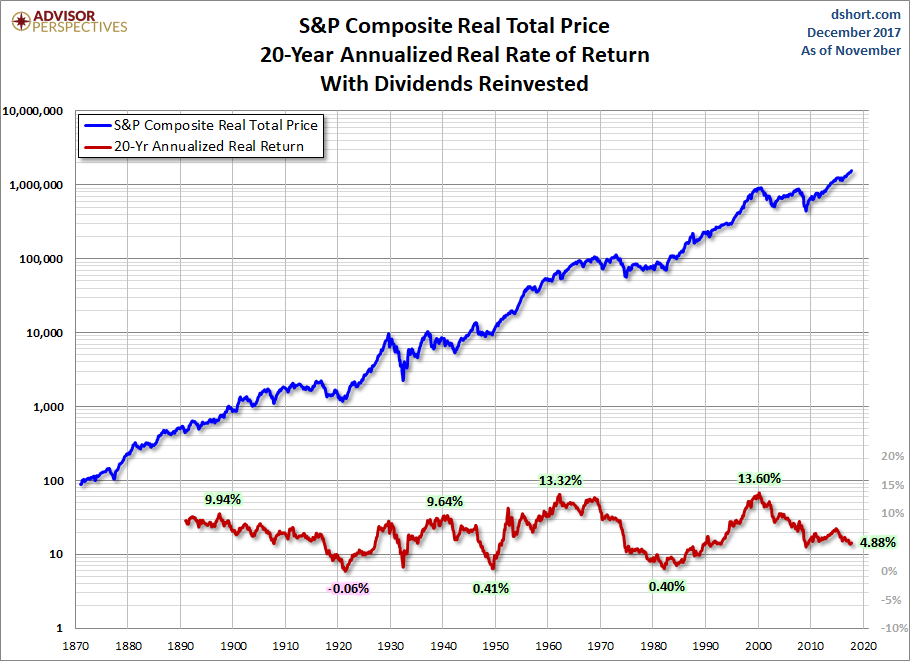
20 and 30-year time horizons are shown below. There was even an occurrence of a negative 20-year period beginning in the 1920s and ending in the 1940s. There is one key phrase I would like to point out in each of these charts: “with dividends reinvested”. These numbers illustrate returns without the withdrawals that most retirees take. Recognizing that our personal time horizons are much shorter than the 67-year mountain chart is imperative in portfolio construction and risk management.


