Leading indicators (e.g., the yield curve) have warned of recession since 2022. While useful, they have a variable lag time. The phenomena a leading indicator predicts (in this case, recession) can take up to two years to come to fruition.
Unfortunately for investors, there is no perfect coincident indicator of recession. NBER economists determine the start dates of recessions years after they begin. That said, economists have developed indicators that give us valuable real-time information.
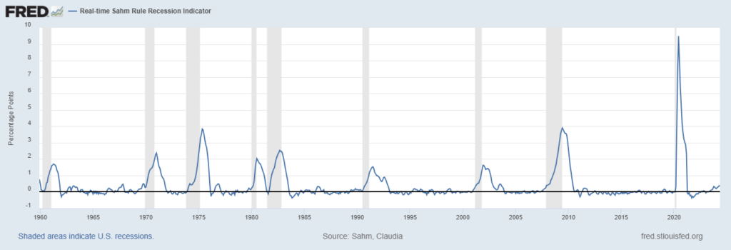
The Sahm Rule
Economist Claudia Sahm created a rule that gives us an early recession warning. The rule triggers if the 3-month average of the unemployment rate rises by 0.5% relative to its 12-month low. By the time the Sahm Rule triggers, we’re already in recession. This rule has signaled every recession over the last 50 years with no false positives.
As of June 28th, the 3-month unemployment rate average is 0.37% above its 12-month low. As you can see in the Federal Reserve chart below, the Sahm Rule is rarely this close to triggering. As such, it merits close attention.
The Beveridge Curve
Federal Reserve chair Mary Daly made headlines this week when she spoke about the Beveridge Curve, stating:
“The latest job market data… shows that we are getting very near the flatter portion of the Beveridge curve. This means that future labor market slowing could translate into higher unemployment, as firms need to adjust not just vacancies but actual jobs.”
This followed a similar analysis from Goldman Sachs economist Jan Hatzius.
So, what is the Beveridge Curve? The Beveridge Curve examines the relationship between job vacancies and unemployment. Economists use it to gauge the health and efficiency of the labor market. You can see a graphical representation of it here:
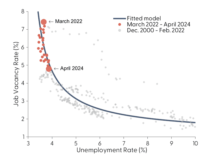
On this curve:
– The vertical axis represents job vacancies (demand for workers)
– The horizontal axis represents the unemployment rate (supply of workers)
The curve slopes downward (left to right). This indicates an inverse relationship between job vacancies and unemployment.
In other words, the unemployment rate tends to be low when job openings are high.
At a certain point, job openings decline to a point where workers who’ve lost their jobs cannot find another. This results in a higher unemployment rate.
Why Does the Beveridge Curve Matter in 2024?
According to the San Francisco Fed, the labor market is close to an inflection point.
As of June 2024, we find ourselves near the flatter part of the Beveridge Curve. Any further softening in labor demand could lead to significant increases in unemployment.
What This Means for Retirement Investors
1. Increased Market Volatility: As the labor market approaches this inflection point, markets may experience increased volatility.
2. Sector Rotation: Different sectors may perform differently as the labor market evolves. Defensive sectors might become more attractive if unemployment rises.
3. Interest Rate Implications: The Federal Reserve’s response to labor market changes could result in lower interest rates, impacting bond yields and stock valuations.
4. Long-term Planning: Understanding these dynamics can help make more informed asset allocation and retirement planning decisions.
Looking Ahead
Monitoring unemployment will provide insights into the economy’s direction through 2024. Labor markets are only one data point. However, their positioning near a potential inflection point makes it relevant for anyone managing assets in this economic environment.